
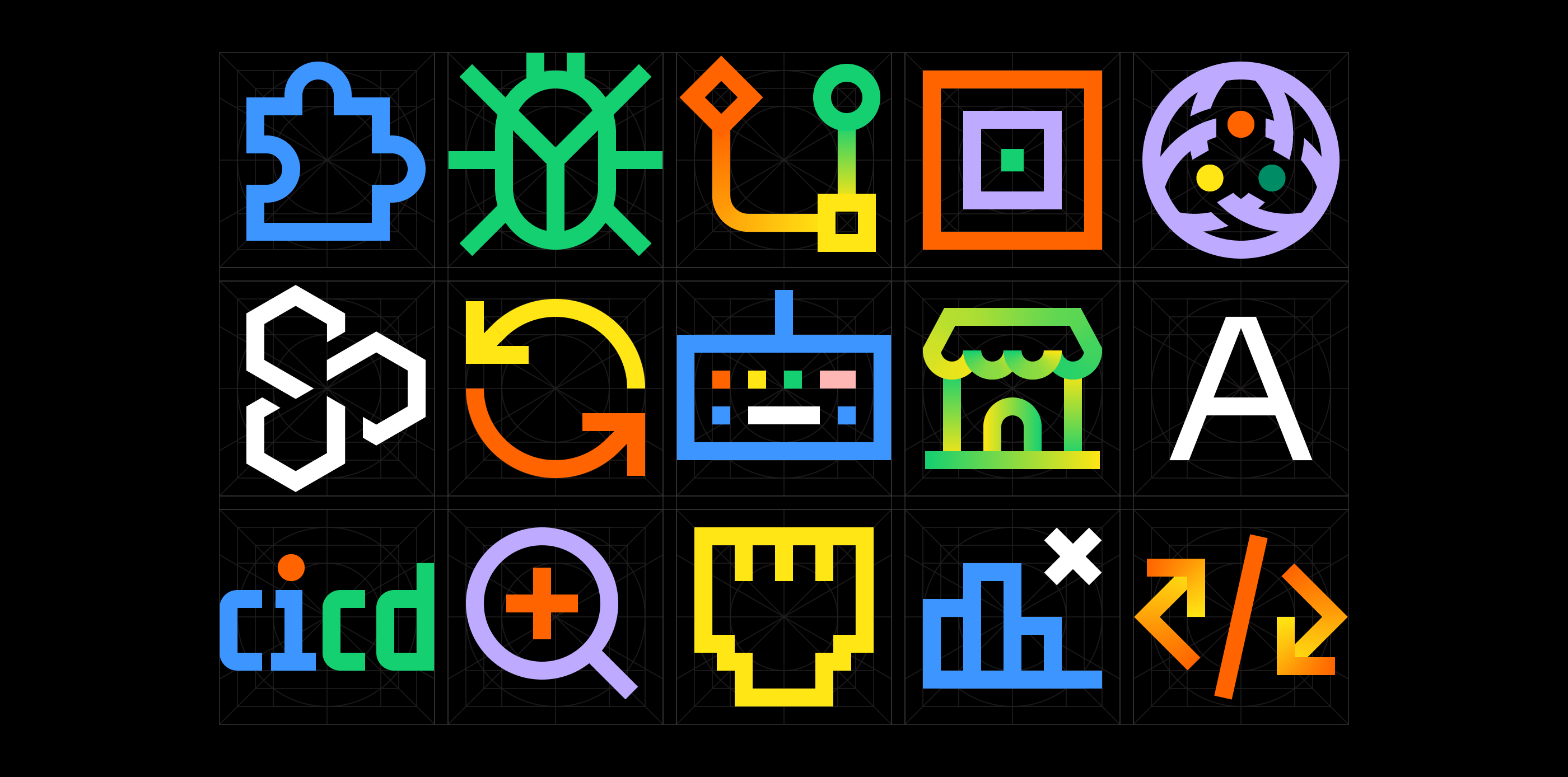
Product Icons
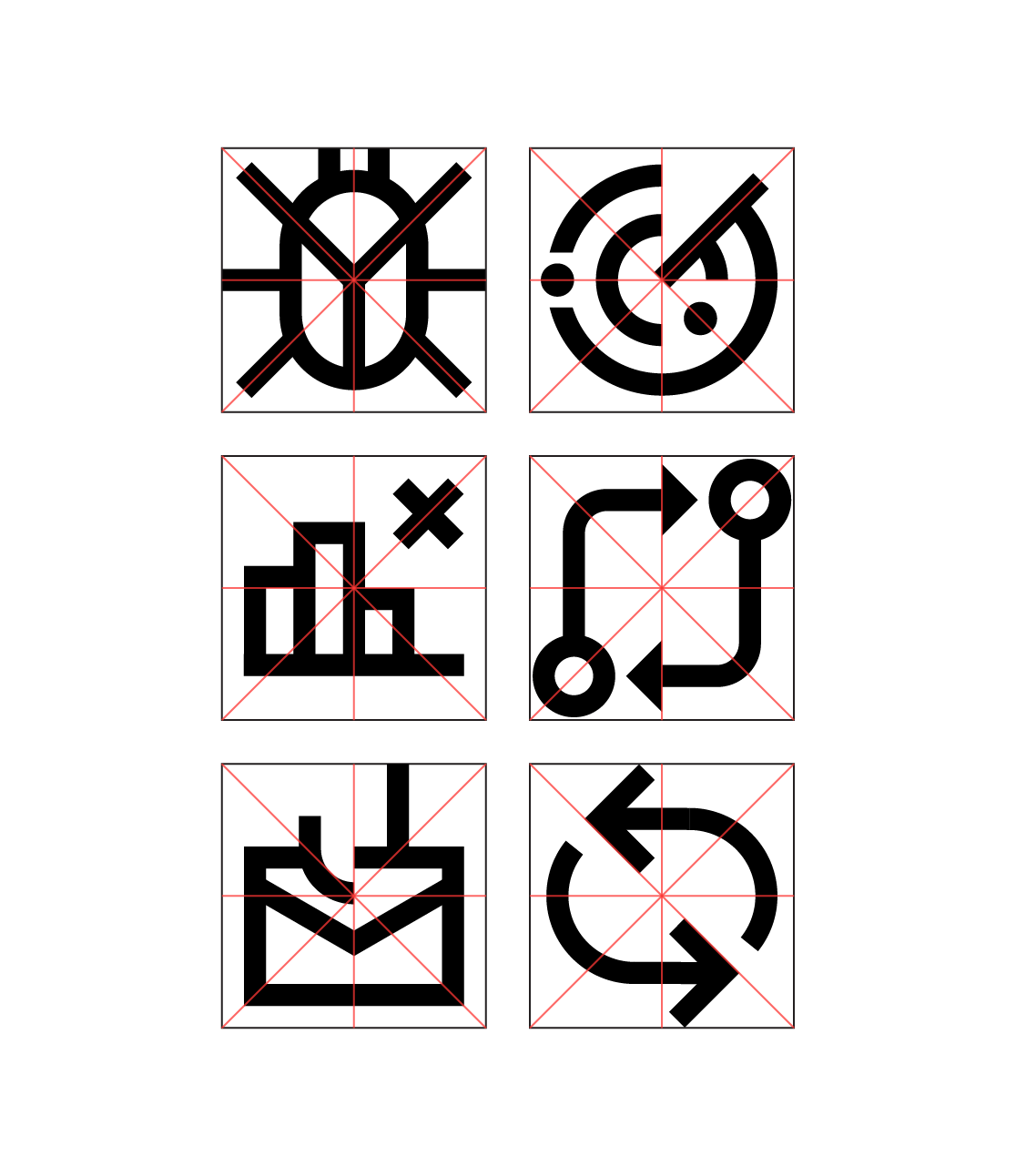
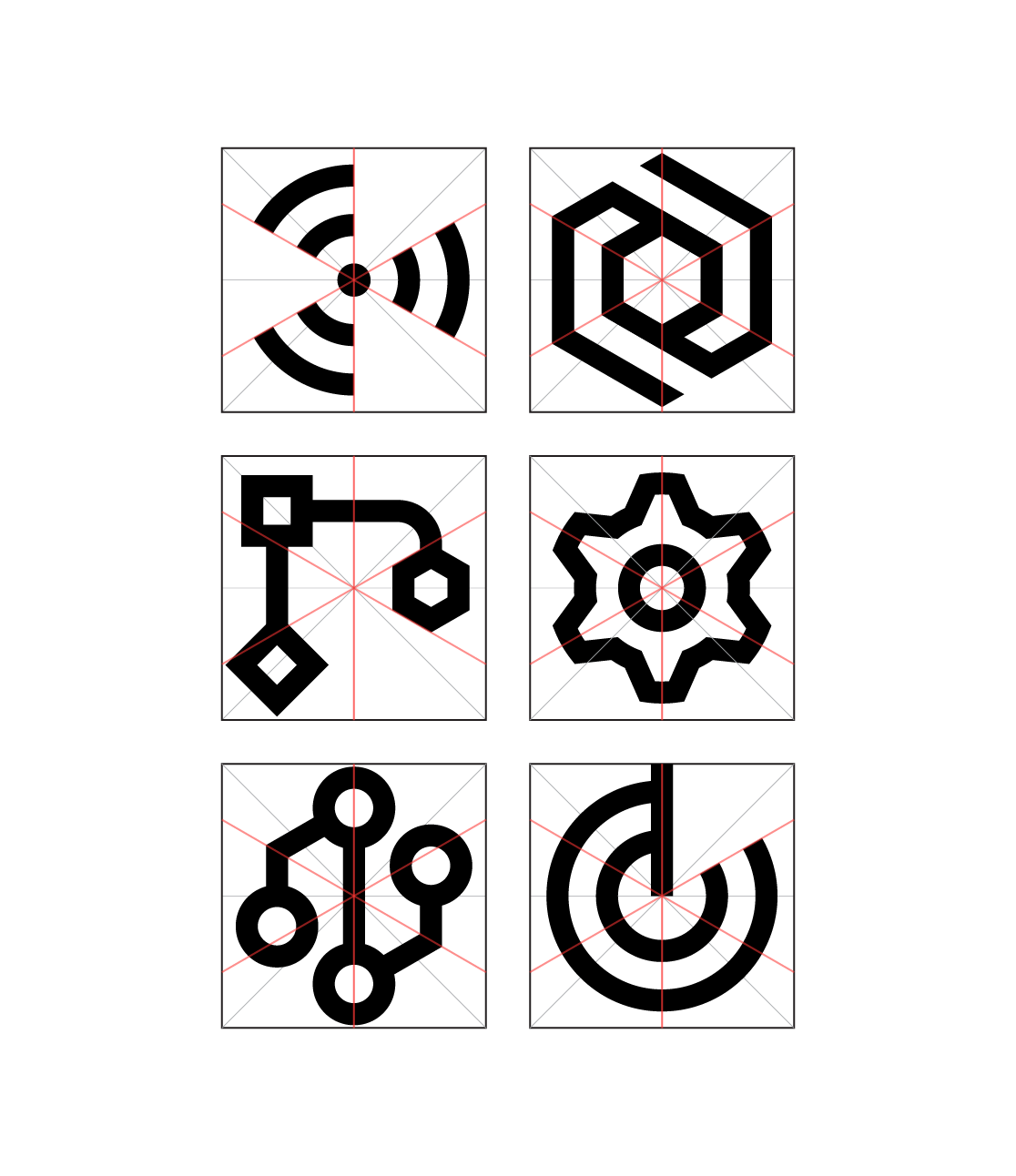
We created a grid system for the iconography that represents the various products that the Datadog platform offers. This system contains a few main components—key shapes, flow lines, and a square grid—in order to maintain consistency in shape, density, and clarity. The key shape component gives the designer six shapes to work off of when they begin to draw a new icon. There are cardinal, orthogonal, and hexagonal flow lines that provide a guide for stopping points, break points, or elements to highlight. The square grid assists in decision-making on the overall shape of the icon. In addition to these three main components, there are rules and guidelines that are specific to particular instances such as parallel lines, dots, arrow heads, etc. This project is ongoing, as each new product that requires an icon is used as a stress test on how flexible and effective this grid system is. As the iconography family grows, adjustments may be made to the system to accommodate the needs of each of the product teams.
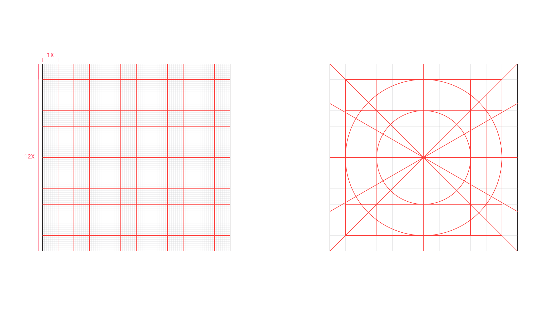
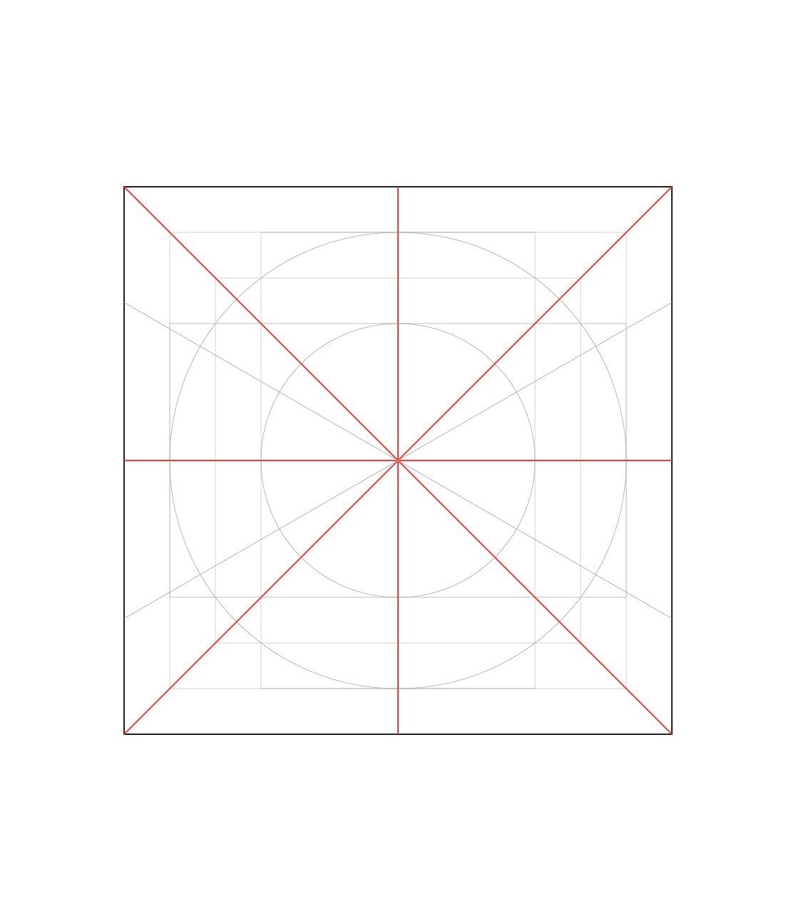
Full grid
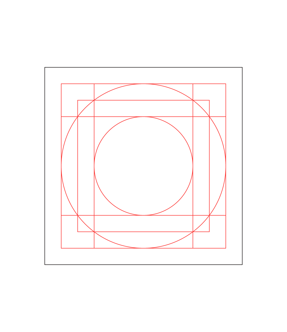
Key shapes
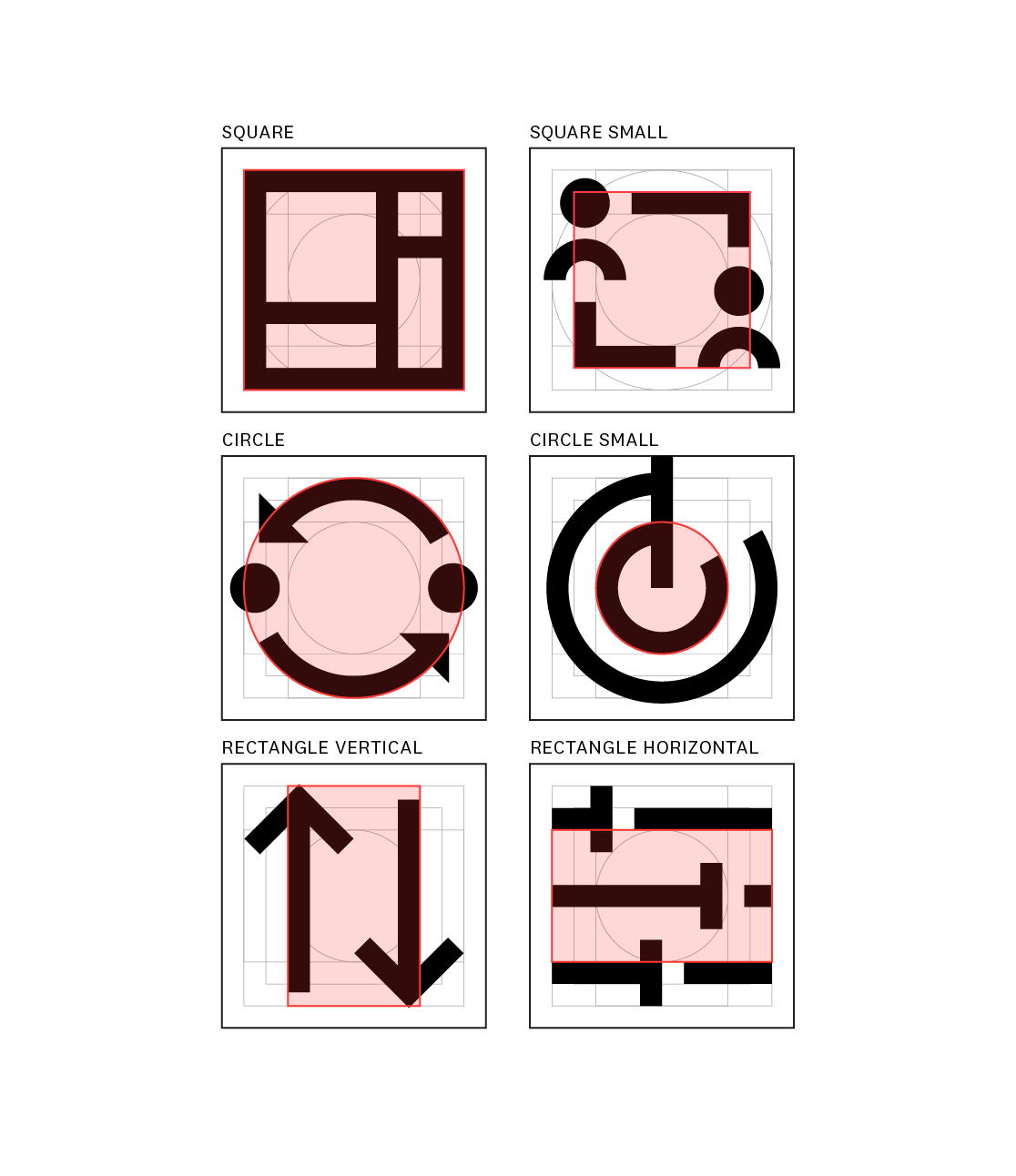
Key shapes example
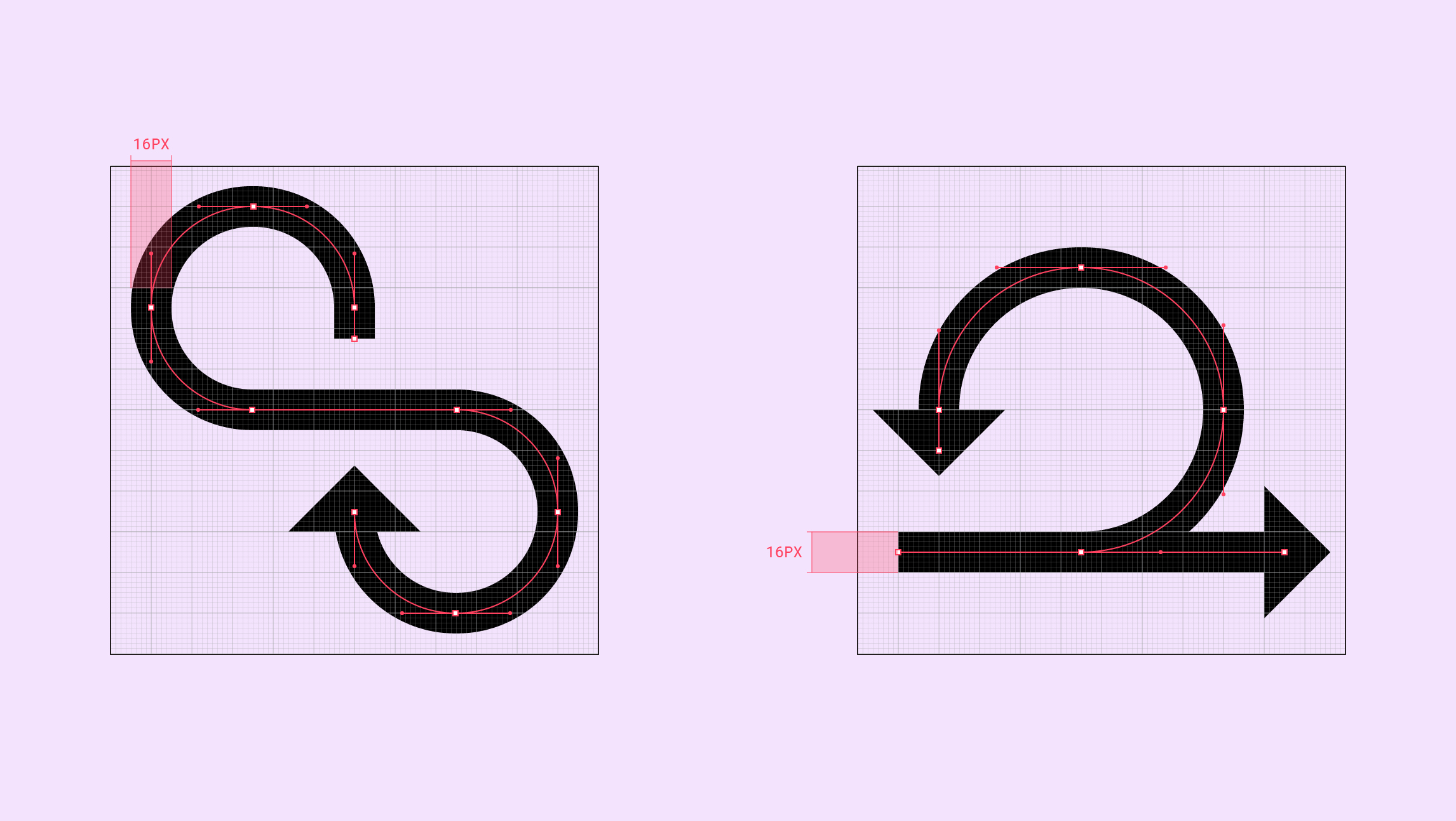
Scale example
Cardinal and orthogonal flowline
Cardinal and orthogonal flowline example
Mono weight stroke weight
Hexagonal flowline
Hexagonal flowline example